10,000 search results
(0.019 seconds)
- Informal Roman by ITC,
$29.00Informal is the work of lettering designer Martin Wait and is reminiscent of the late 1940s and early 1950s. Informal is worthy of its name and perfect for anything with a look of the mid-20th century or simply a casual, spontaneous appearance. - Inform by ParaType,
$30.00 The typeface was designed by Gennady Baryshnikov. Bold Italic is based on Flash typeface, 1939, by Edwin W. Sharr. Additional styles were developed at ParaType (ParaGraph) in 1992 by Vladimir Yefimov and Alexander Tarbeev. Inspired by non-joining brush calligraphy. For use in advertising and display typography.
 - Informative by Latinotype,
$39.00 Informative is a typeface consisting of a whole family of sans fonts and a collection of thematic pictograms. This combination of two different types of communication reflects the current need for using text and images as means of conveying information in a complementary way. The family comes with a text version of 7 weights (with matching italics)—Thin, Light, Regular, Medium, SemiBold, Bold and Black, and includes 7 thematic icons sets which allude to elements related to alimentation, city, energy, people, politics, sports and work. Each set contains 88 glyphs and includes both outline and black versions. The text font contains a set of 423 glyphs that support 207 different languages. Informative is a clean, simple and versatile typeface well-suited for a wide range of graphic design and visual communication projects. This font has especially been designed for infographics, maps and digital applications.
 - Informe by Arterfak Project,
$19.00 Informe is a modern monospaced typeface. Built with strong letter shapes, and industrial taste. This typeface was designed to read well in small and large sizes. Informe is suitable for digital interface, simple coding, label, editorial, tickets, and more. Available in 4 styles that you can use for the headline, subheadline, tagline, and body text. Equipped with some alternates and multilingual support.
 - Romance Roman JNL by Jeff Levine,
$29.00 The antique sheet music for the 1915 song "A Girl in Your Arms is Worth Two in Your Dreams" had its title hand lettered in a Roman typeface that reflected ever so slightly the Art Nouveau influences of the time. This design is now available as Romance Roman JNL, in both regular and oblique versions.
 - Rahere Informal by ULGA Type,
$18.99 Rahere Informal is a slab semi-serif typeface that has a seriously charming personality and a little spring in its step. Serifs bend and flick, giving the characters a spirited, almost calligraphic feel. It's lively and friendly without being whimsical, great for messages that need a casual but credible tone with a bit of zing in the mix. Rahere Informal is suitable for a wide range of applications such as information signage, packaging, advertising, brochures, catalogues, screen text, visual identities and opera festivals. Want an annual report that pleases the board, shareholders and investors? Set it in Rahere Informal - that’ll put a smile on everyone’s face. The family comes in six weights from light to extra bold with corresponding italics. The lighter weights are more delicate, an evenly-spaced flamboyance of flamingos basking in the sun. As the weights get heavier, characters transform into a tight-knit group of line dancing rhinos. All styles contain a set of swash caps, a few ligatures and alternatives. Nice. The character set covers most European languages plus Vietnamese. Each weight contains lining & non-aligning numerals in both proportional & tabular spacing. The tabular numerals share the same width across all weights and styles (matching Rahere Sans and Rahere Slab). If a companion sans serif is needed, Rahere Sans is the ideal partner. They are both part of the extended Rahere typeface family and have been designed to complement each other. Seriously charming, charmingly serious. Seriously, what more do you want from a typeface? Rahere, founder of St Barts in London The typeface is named after Rahere, a 12th-century Anglo-Norman priest, who founded the Priory of the Hospital of St Bartholomew, London in 1123. In 2007 I was successfully treated at Barts for relapsed testicular cancer so I’m indebted to all the doctors, nurses and support staff who work there. A special shout out to Orchid Cancer – a UK charity that helps men affected by cancer – who funded the research for my treatment.
 - Lake Informal by Linotype,
$29.99Lake Informal was designed by Rudolf Ruzicka in 1935. It is a handwriting font which imitates the result of a feather script on paper. A dynamic, individual font, it is also very legible even in smaller point sizes and is perfect for personal correspondence. - Matita Informal by Trine Rask,
$30.00 Matita Informal is part of a larger type family developed from 2005-2019 with handwriting in mind. A humanistic informal sans serif in five weights containing swashes, alternative characters, old style, lining, tabular & proportional figures. The family share proportions and weights to ensure all fonts (family members) work together well. Matita Informal is a very friendly typeface suitable for many purposes.
 - Hieroglyph Informal by Grummedia,
$20.00Designed for a role-playing scenario, this font uses Egyptian hieroglyphs closely relating to characters in the English alphabet as its starting point. It’s fun to use and has many extra hieroglyphs taken from monumental carvings. - Informal 011 by Bitstream,
$29.99 - Mantika Informal by Linotype,
$50.99 Jürgen Weltin's Mantika Informal is pretty difficult to categorize, but very easy to like. This particularly reader-friendly typeface in regular and bold weights, brings to the table the informal fluidity of a script, the consistency of an inclined italic, and the open and airy forms and contrast of a humanist sans. The result is a warm, approachable, and very legible typeface that is never static and staid, but rather invites an attentive, reading eye. The original idea behind Mantika Informal lay in the challenge to create a typeface for setting children's books. German designer Jürgen Weltin aimed to create a reading typeface for those just starting to learn how to read. On the one hand, it should help create clear word-images; on the other, its letterforms should remain uncomplicated but resist mechanical and industrial sterility. Mantika?s subtle cursive lines stress the printed word's connection with handwriting, in addition to making the transition from school writing exercises to printed texts seamless and effortless. The resulting slightly organic and cursive forms that developed during the design process are so captivating that Mantika Informal may be used for a multitude of unintended applications - anywhere a friendly and informal yet sophisticated character could lend a helping hand, Mantika is there, giving a fresh accent to anything from packaging design to food products. With a broad character set encompassing support for Cyrillic and Green, Mantika Informal's two fonts make for a versatile and dynamic typeface that surely will find its place in a broad range of applications.
 - Agatized Informal by ULGA Type,
$26.00 Agatized Informal is a rough-edged stencil typeface with chunky letterforms and tight spacing. Designed primarily for display use, it’s ideal for posters, logos, advertising, book cover designs or small chunks of text such as pull-out quotes. The design is something of an enigma, a curious mish-mash of genres – imagine splicing Uncle Buck and Deadpool into a horror movie – it’s big, bold and funny although has a dark side. But what really makes this typeface a joy to drive is its boot full of alternative characters and ligatures. There is a saying: Use sparingly. Not on this street! Make your Glyphs palette burn rubber. Set your OpenType to full throttle: crank up your style and get those liga-tyres screeching. Agatized is a souped-up old campervan spinning doughnuts on the beach. The design started life as a piece of lettering for a book design that didn’t progress past the sketch stage. I liked the rough, dense character shapes, so during some down time I started drawing more characters and the lure of a new typeface pulled me in from there. Although this is a single-weight typeface it has a younger sibling, Agatized Formal, a neater, more dapper brother, smoother round the chops and smartly dressed – certainly no less fun though.
 - Informal 011 by Tilde,
$39.75 - Informal Black by Monotype,
$29.99 - Roman by MacCampus,
$30.00Linotype Banjoman was designed by Paul Veres. Most of its basic forms are constructed although some characters, like the a, g, or p, are more freely designed. This font is available in a variety of weights and styles. The bold weights are best for headlines or emphasis in text and the balanced Text styles were designed specifically for running text. Linotype Banjoman is an independent yet well-mannered font suitable for a variety of purposes. - Infoma by Stawix,
$40.00 Infoma is designed based on simplicity results in easy and comfortable usage which allows Infoma to perform flawlessly in every layouts. If meticulous, flexible, eye-pleasing and easy to use typeface you are looking for, we recommend Infoma. Infoma consists of 18 styles from Line to Ultra, supporting many OpenType features, such as tabular numerals, inferiors & superiors, numerators & denominators, fractions, ligatures etc.
 - Enforcer by Tour De Force,
$25.00 Modern simple typeface expressing sharp and bright words without need for writing something really smart. Made by Dusan Jelesijevic one day when he left without anything smart to say or write, so he just grabbed a pencil and forced the paper to be cooperative. Someone said that this typeface looks like the ancient Greeks went in present future and used contemporary equipment for writing those letters. It is ideal for branding and avantgarde identities.
 - DeForme by Ingo,
$39.00 A deconstructive variation of ”Clarendon“ DéFormé was born out of the distortion of the time-honored ”Clarendon“ letterforms, in which the stems and thin strokes have been reversed. Thus, a typeface was created which will remind some readers of a Western typeface, and others of the ordinary typeface of a typewriter. Actually, it is still a robust Clarendon, which has survived ists disfigurement quite well. DéFormé, like its ”mother“, is easily legible, in spite of the inherent emphasis which one is not used to seeing.
 - Informatic by Fatchair,
$9.95A clean and simple sans-serif, Informatic was designed as a friendlier alternative to DIN. - Uniform by Miller Type Foundry,
$25.99 Uniform is a multi-width geometric type family designed around the circle. The O of the Regular width is based on a circle, the O of the Condensed width is based on 1.5 circles stacked (with straight sides) and the O of the Extra Condensed width is based on two circles stacked with straight sides as well, and all other characters are derived from this initial concept. This unique idea creates a remarkably fresh type family that bridges the gap between circular geometric typefaces and condensed straight-sided typefaces. Uniform also includes many opentype features like Old Style Figures, Tabular Lining Figures, Alternate characters, Ligatures and more. Uniform was first drawn starting with the Black weight. This careful process allows each character to look consistent and balanced through all weights. As a result, the typeface does not ‘break down’ or lose its form in the boldest weights like many typefaces do. The three widths of Uniform make an ideal type family for a host of various uses. From branding to web design, book covers to signage, Uniform is a very versatile solution to complex typographic needs.
 - Linford by Yoga Letter,
$15.00 "Linford" is a very professional and elegant serif font. This font is very easy to use for all your work. This font comes with 8 elegant and attractive ligatures. This font can be used to promote all your business (branding, banners, posters, social media, hotel promotions, villas, companies, products, invitations, and more).
 - Delargo DT Informal by DTP Types,
$49.00An original design by Malcolm Wooden of DTP Types Limited. - Mantika Informal Paneuropean by Linotype,
$67.99Jürgen Weltin's Mantika Informal is pretty difficult to categorize, but very easy to like. This particularly reader-friendly typeface in regular and bold weights, brings to the table the informal fluidity of a script, the consistency of an inclined italic, and the open and airy forms and contrast of a humanist sans. The result is a warm, approachable, and very legible typeface that is never static and staid, but rather invites an attentive, reading eye. The original idea behind Mantika Informal lay in the challenge to create a typeface for setting children's books. German designer Jürgen Weltin aimed to create a reading typeface for those just starting to learn how to read. On the one hand, it should help create clear word-images; on the other, its letterforms should remain uncomplicated but resist mechanical and industrial sterility. Mantika?s subtle cursive lines stress the printed word's connection with handwriting, in addition to making the transition from school writing exercises to printed texts seamless and effortless. The resulting slightly organic and cursive forms that developed during the design process are so captivating that Mantika Informal may be used for a multitude of unintended applications - anywhere a friendly and informal yet sophisticated character could lend a helping hand, Mantika is there, giving a fresh accent to anything from packaging design to food products. With a broad character set encompassing support for Cyrillic and Green, Mantika Informal's two fonts make for a versatile and dynamic typeface that surely will find its place in a broad range of applications. - Informational Sans JNL by Jeff Levine,
$29.00 Featuring condensed, block hand lettering, Informational Sans JNL was modeled from a selection of water applied sign decals once made by the Duro Decal Company of Chicago and is available in both regular and oblique versions. About fifty different small decal signs covered a wide range of general purpose information such as “Open”, Closed”, “Please Pay When Served”, etc.
 - Informational Gothic JNL by Jeff Levine,
$29.00 The Wood-Regan Instruments Company (Wrico) of New Jersey manufactured for decades a line of lettering kits called the Wrico Sign Maker. With only special ink pens, plastic templates and a template guide anyone could letter clean, clear signs, posters and notices. Based on the same principles of architectural templates, the lettering was [for the most part] utilitarian and functional. Few templates were of stylized or decorative lettering. Informational Gothic JNL and its oblique version are based on the four inch high lettering templates from one of those kits.
 - Eckhardt Informal JNL by Jeff Levine,
$29.00 Eckhardt Informal JNL was found in a Dan Solo alphabets book under the name "Circus Wagon". This hand-lettered design with a playful inline is reminiscent of the show cards of the 1940s and 1950s. The Eckhardt series of typefaces is named in honor of the late Al Eckhardt, Jr. - a good friend of type designer Jeff Levine whose talents in hand-crafting attractive lettering was appreciated by many. His work, like the others before him is fast become a lost art in today's technology-driven world. Eckhardt Informal JNL is available in it's regular (inline) version and also as a solid version.
 - ITC Stone Informal by ITC,
$29.00 Sumner Stone worked together with Bob Ishi of Adobe to create the Stone family fonts, which appeared in 1987. Coincidentally, ishi is the Japanese word for stone, which precluded any squabbling about whose name the font would carry. The family consists of three types of fonts, a serif, a sans-serif and an informal style. The Stone fonts are very legible and make a modern, dynamic impression.
 - Informational Sign JNL by Jeff Levine,
$29.00 A vintage metal sign saying "No Dogs Allowed" was the model for the ultra-bold Art Deco-influenced lettering comprising Informational Sign JNL.
 - Palatino Sans Informal by Linotype,
$29.99 Palatino Sans Informal was designed as part of a group of three font families: Palatino nova, Palatino Sans, and Palatino Sans Informal. Together these three families act as the fulfilment of Herman Zapf’s original Palatino idea. Palatino, which was born as a metal typeface in 1950, proved to be one of the 20th Century’s most popular designs. Not only is Palatino Sans Informal a completely new typeface, it is also a completely new interpretation of the entire sans serif genre. Its letterforms are curved, rounded, and soft, not hard and industrial. In comparison with Palatino Sans, Palatino Sans Informal offers eccentricities that are somewhat artistic and more individual looking. The fonts in the Palatino Sans Informal family include several OpenType features, such as an extended character set covering all Latin-based European languages, old style figures, small caps, fractions, ordinals, ligatures, alternates, and ornaments. Palatino Sans Informal can be mixed well with Palatino and Palatino Sans.
 - Ronan by Mad Irishman Productions,
$22.00A bold font evoking Dark Age adventure, Ronan can be used for titles requiring Latin or Cyrillic alphabets. - Romany by Ascender,
$50.99 The Romany™ typeface family is a delightful typographic confectionary that will bring affability and charm to both print and interactive design projects. Be it an online game, digital app, hardcopy packaging, or larger than life poster, Romany will deliver. When first designed by A.R. Bosco for American Type Founders in 1934, Romany was a single weight design. Relatively popular as hand-set type, Romany was not made into digital fonts – until now. The septuagenarian design was updated, reimagined and enlarged into a small family by Terrance Weinzierl.
 - Romana by URW Type Foundry,
$35.99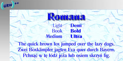
- Romantic by Sealoung,
$17.00 Husband Romantic is a lovely and elegant duo font (script and serif). It can easily be matched to an incredibly large set of projects, so add it to your creative ideas and notice how it makes them stand out! Husband Romantic is PUA encoded which means you can access all of the glyphs and swashes with ease!
 - Rowan by VP Creative Shop,
$12.00 Introducing Rowan - Elegant typeface. 116 font styles included and 1 script Rowan is elegant and retro typeface loaded with 116 font styles (narrowest, narrower, narrow, regular, wide, wider, rough, outline and script with 6 weights) 87 languages support, alternate and ligature glyphs to make you typography truly unique! Language Support : Afrikaans, Albanian, Asu, Basque, Bemba, Bena, Breton, Chiga, Colognian, Cornish, Czech, Danish, Dutch, Embu, English, Estonian, Faroese, Filipino, Finnish, French, Friulian, Galician, Ganda, German, Gusi,i Hungarian, Indonesian, Irish, Italian, Jola-Fonyi, Kabuverdianu, Kalenjin, Kamba, Kikuyu, Kinyarwanda, Latvian, Lithuanian, Lower Sorbian, Luo, Luxembourgish, Luyia, Machame, Makhuwa-Meetto, Makonde, Malagasy, Maltese, Manx, Meru, Morisyen, North Ndebele, Norwegian, Bokmål, Norwegian, Nynorsk, Nyankole, Oromo, Polish, Portuguese, Quechua, Romanian, Romansh, Rombo, Rundi, Rwa, Samburu, Sango, Sangu, Scottish, Gaelic, Sena, Shambala, Shona, Slovak, Soga, Somali, Spanish, Swahili, Swedish, Swiss, German, Taita, Teso, Turkish, Upper, Sorbian, Uzbek (Latin), Volapük, Vunjo, Walser, Welsh, Western Frisian, Zulu FEATURES Uppercase, lowercase, numeral, punctuation & Symbol ligature glyphs alternates Narrowest - regular, italic and styled with 6 weights Narrower - regular, italic and styled with 6 weights Narrow - regular, italic and styled with 6 weights Regular - regular, italic and styled with 6 weights Wide - regular, italic and styled with 6 weights Wider - regular, italic and styled with 6 weights 1 script 2 rough styles 6 outline fonts Multilingual support - 87 languages No special software is required to type out the standard characters of the Typeface. How to access alternate glyphs? To access alternate glyphs in Adobe InDesign or Illustrator, choose Window Type & Tables Glyphs In Photoshop, choose Window Glyphs. In the panel that opens, click the Show menu and choose Alternates for Selection. Double-click an alternate's thumbnail to swap them out. Feel free to contact me if you have any questions! Mock ups and backgrounds used are not included. Thank you! Enjoy!
 - Romana by ITC,
$29.99 - Noman by Arendxstudio,
$15.00 Noman - Bold Display Fontl, retro looking display font. Whether you use it for cartoon related designs, children games or just any creation that requires a lovely touch, this font will be an amazing choice. Features : • Character Set A-Z • Numerals & Punctuations (OpenType Standard) • Accents (Multilingual characters) Ligature
 - Rolan by Larin Type Co,
$12.00 Rolan This is a light elongated font that includes light, regular and bold weights, as well as these weights in a rough style. It is versatile and will perfectly fit into any project in both modern and vintage style, it is perfect for creating a logo, banners, flyers, labels, branding and much more This font family has only Capital letters and some of them are different.
 - Ropan by Larin Type Co,
$16.00 Ropan this is a modern geometric sans-serif font that includes nine weights from thin to black. This multi-purpose font captures a huge range for the design and creation of your project. Ropan will perfectly cope with a variety of tasks and he will always look stylish and modern. With it, you can create logos, labels, use in advertising, packaging, branding, book covers and magazines, cosmetics, banners, posters, headings, descriptions and much more. This font is easy to use has OpenType features.
 - Romantics by Almarkha Type,
$35.00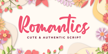 Romantics – is a Cute & Authentic Script font with a natural handwritten feel. It has sweety swash that are perfect for any creative design. This handmade font will make your design has a beautiful natural touch for each details. It is perfect for any design project as Invitation,logo, book cover, craft or any design purposes. This font is PUA encoded which means you can access all of the magical glyphs and swashes with ease! It also features a wealth of special features including alternate glyphs and ligatures.
 - Romanus by Zamjump,
$7.00 Romanus is a classic font with strong characters, ideal for logos, event titles, quotes, magazines, product packaging, or anything that requires a classic style boost. Romanus offers international languages and characters. Type a-z using this font, and you will get a unique font arrangement and strong characters.
Page 1 of 250Next page